
XY diagrams are used to display the connection between the specific quantities in the cycle. EBSILON®Professional uses MS Excel for displaying the XY diagrams. Thus, it is possible to save these diagrams as Excel files and to execute additional operations within Excel.
Before you create an XY diagram, you must calculate the data, which is to be displayed. In general, there should be several profiles with different load and ambient conditions. Each profile results in a point in the diagram.
To create an XY diagram, select the menu command ExtrasàDiagramsàXT Diagram (Excel)….
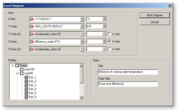
The screen shown below opens:

In the drop-down list "X-Axis" you must select the quantities to be displayed on the x-axis of your diagram. If you open the drop-down list by clicking on the arrow button on the right side of the input field, a browser list opens, which shows all the components and lines in the cycle. Click on the "+" box to the left of the names, extend this entry and you can select a specification value (displayed by a blue arrow pointing to the name of the specification value) or a calculated value (displayed by a red arrow from the direction of the result value). In the example shown here, the "RESULT" value of the measured value "T17" is selected, which represents the cooling water temperature in the model Block750.
In the drop-down list "Y1-axis" you must select the quantities to be displayed on the y-axis of your diagram. If you wish to include several quantities in your diagram, you can either activate a second value for the Y1-axis or use the Y2-axis (the right y-axis in your diagram). Check the box "in Use" and select the necessary quantity. In this example, the generator power is shown on the left y-axis, and the net efficiency on the right y-axis.
In addition, it is also possible to select the units for the quantities to be displayed. The default setting is the unit displayed in the EBSILON®Professional model.
After selecting the axes, you must specify the profile, in which the diagram is to be included. This is done by activating the check boxes in the profile explorer.
In the "Texts" region you can specify a title for the Excel report and for the diagram.
Click on "Build Diagram" to create the diagram. MS Excel is now opened and gives you a first view of your result. You are now asked to save the report within Excel or to discard it. To save your file, select a folder and a name for the file (you must make a note of the folder, in order to be able to find your file again!) and click on "Save".
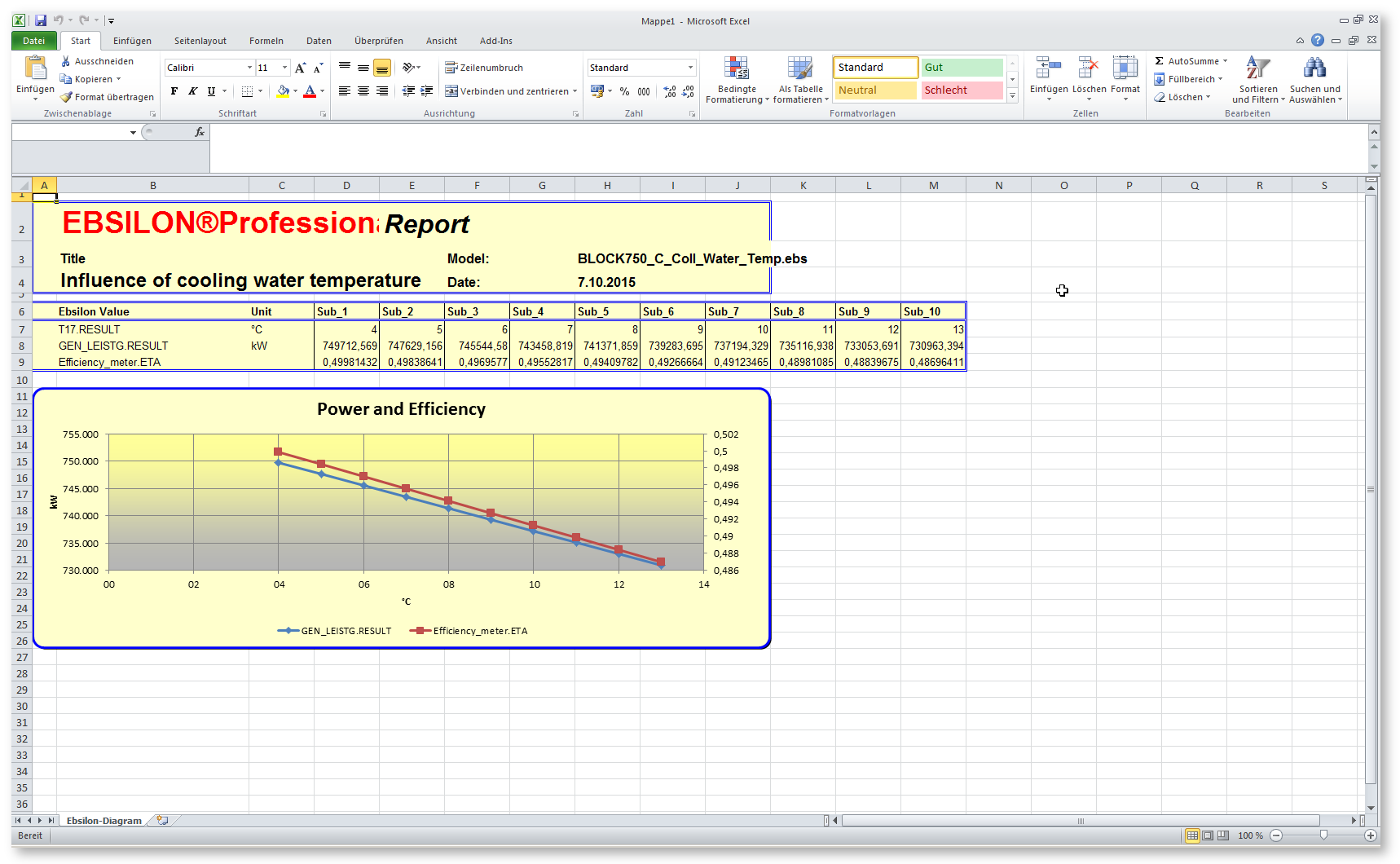
You will now see the following diagram:

There is a header region (lines 1 – 4), which shows the title, file name and the actual data, and a data region (lines 7 – 9, in the case), which shows the data used in the diagram as well as the diagram region itself.
The style and the layout of these XY diagrams are such that a simple handling is ensured. If you want your own style, you can use the User Excel Interface, for creating your own diagrams.