
EBSILON®Professional Online Documentation


Tool tip windows are displayed when you move the mouse pointer over a component or pipeline.
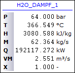
The values displayed here by default are defined under consideration of the
You can find the Tooltip-Options under "Extras\General Settings\User Interface\Display\Tooltips...".
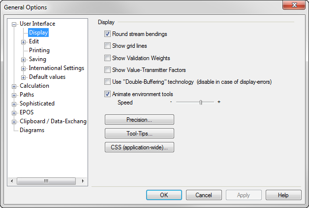
You can modify tooltip assignments by clicking on the “Tooltips” button. The “Tooltips” window opens. You can activate and deactivate tooltips with the check-box on the top. In the field below it, the delay before displaying a tooltip can be set.
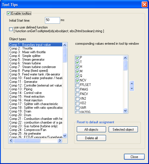
The left side of the window (“Object types”) displays a list of all component- and pipeline types.
Select a type in the list (component or pipeline) with a mouse click. The right side ("Corresponding values from tooltip-window") displays a list of all specification and result values that are available for the selected type of object. Use the check boxes to the left of each quantity to define the values, which will be displayed in the tool tip window. The check box is a toggle button: The first mouse click selects the item, the next deselects it.
The spin buttons on the right side of the "Corresponding values from tooltip-window" region can be used to arrange the order in which the quantities are displayed in the tool tip window. The order of terms in this list reflects only their order in the tool tip window.
To reset all tool tip entries to the default ones, press the "All objects" button.
To reset the tool tip entries of only one object, select it in the left window and press the "Selected object" button.
To delete all tool tip entries, press the ”Delete All” button.
By pressing the button ”CSS” on the display tab of the General Settings window you open a window where you can define Cascading Style Sheets for HTML text fields.
The following CSS-commands modify the tool tips:
|
Command |
Description |
|
.tooltip-header{font-size:8pt} |
Changes the text size of the tooltip-title (default: 8pt) |
|
.tooltip-col1{font-size:8pt} |
Changes the font size of the first tooltip-line (default: 8pt) |
|
.tooltip-col2{font-size:8pt} |
Changes the font size of the second tooltip-line (default: 8pt) |
|
.tooltip-col3{font-size:8pt} |
Changes the font size of the third tooltip-line (default: 8pt) |
|
.tooltip-rule{color:blue} |
Changes die font colour of the tooltip (default:blue) |
These commands should be defined application-wide. For that go to "Extras\General Settings\User Interface\Display\CSS (application-wide)...".
A text field appears where you can define Cascading Style Sheets for HTML text fields. Among others the CSS-commands mentioned above are available here.
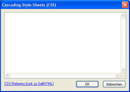
(Attention: at the beginning of every CSS-command a dot has to be applied)
Activating the check-box ”Apply User-defined Function” in the tooltip-window makes the use of user-defined tooltips instead of built in tooltips possible. For that you have to implement an EbsScript-function "onGetTooltipText" that returns a string that contains the desired view of the tooltip as HTML-code. By using this function you can transform the tooltip entirely.
function onGetTooltiptext(obj:ebsobject; ebs2html:boolean):string